Prettier maps in R and a first step towards interactivity
For today, we’re going to focus primarily on buildiing maps in ggplot2. Although not specifically designed for mapping, getting familiar with the syntax and approach for layering information into your plots whether it’s spatial or not. It can be a little trying because ggplot2 is considerably slower to render than tmap, but learning how to work within the ggplot2 paradigm will pay a variety of dividends when we move into interactive plots with plotly
Loading some new packages
We are going to add the ggspatial package and the plotly package to our typical list of packages. ggspatial provides access to a variety of functions that can make mapmaking easier with ggplot2. plotly will be the backbone of our attempts to make interactive maps.
library(tidyverse)
## ── Attaching packages ─────────────────────────────────────── tidyverse 1.3.1 ──
## ✓ ggplot2 3.3.5 ✓ purrr 0.3.4
## ✓ tibble 3.1.3 ✓ dplyr 1.0.7
## ✓ tidyr 1.1.3 ✓ stringr 1.4.0
## ✓ readr 2.0.0 ✓ forcats 0.5.1
## ── Conflicts ────────────────────────────────────────── tidyverse_conflicts() ──
## x dplyr::filter() masks stats::filter()
## x dplyr::lag() masks stats::lag()
library(pander)
library(sf)
## Linking to GEOS 3.8.1, GDAL 3.2.1, PROJ 7.2.1
library(terra)
## terra version 1.3.22
##
## Attaching package: 'terra'
## The following object is masked from 'package:pander':
##
## wrap
## The following object is masked from 'package:dplyr':
##
## src
library(units)
## udunits database from /Library/Frameworks/R.framework/Versions/4.1/Resources/library/units/share/udunits/udunits2.xml
library(ggmap)
## Google's Terms of Service: https://cloud.google.com/maps-platform/terms/.
## Please cite ggmap if you use it! See citation("ggmap") for details.
##
## Attaching package: 'ggmap'
## The following object is masked from 'package:terra':
##
## inset
library(cartogram)
##
## Attaching package: 'cartogram'
## The following object is masked from 'package:terra':
##
## cartogram
library(patchwork)
##
## Attaching package: 'patchwork'
## The following object is masked from 'package:terra':
##
## area
library(tmap)
library(viridis)
## Loading required package: viridisLite
library(tigris)
## To enable
## caching of data, set `options(tigris_use_cache = TRUE)` in your R script or .Rprofile.
library(ggspatial)
library(plotly)
##
## Attaching package: 'plotly'
## The following object is masked from 'package:ggmap':
##
## wind
## The following object is masked from 'package:ggplot2':
##
## last_plot
## The following object is masked from 'package:stats':
##
## filter
## The following object is masked from 'package:graphics':
##
## layout
Load the data
Here I’m loading data on human modification (from David Theobald), the mammal species richness data, and the land value data. I’ve also added some vectors with Idaho’s boundaries, some census data, and the GAP Status 1 and 2 PAs.
#base.dir <- "/Users/mattwilliamson/Google Drive/My Drive/TEACHING/Intro_Spatial_Data_R/Data/session18/"
base.dir <- "/Users/matthewwilliamson/Downloads/session18/"
land.value <- rast(paste0(base.dir,"Regval.tif"))
human.mod <- rast(paste0(base.dir,"hmi.tif"))
mammal.rich <- catalyze(rast(paste0(base.dir,"Mammals_total_richness.tif")))[[2]]
idaho <- states() %>%
filter(., STUSPS == "ID")
land.value.crop <- terra::crop(land.value, terra::project(vect(idaho), crs(land.value)))
human.mod.crop <- terra::crop(human.mod, terra::project(vect(idaho), crs(human.mod)))
mammal.rich.crop <- terra::crop(mammal.rich, terra::project(vect(idaho), crs(mammal.rich)))
land.value.project <- terra::resample(
terra::project(land.value.crop, crs(human.mod.crop)),
human.mod.crop)
mammal.rich.project <- terra::resample(
terra::project(mammal.rich.crop, crs(human.mod.crop)),
human.mod.crop)
rast.stack <- c(human.mod.crop, land.value.project, mammal.rich.project)
idaho <- idaho %>%
st_transform(., crs = st_crs(rast.stack))
idaho.counties <- counties(state = "ID") %>%
st_transform(., crs = st_crs(rast.stack))
idaho.pas <- st_read(paste0(base.dir,"westernPAs.shp")) %>%
filter(., Stat_Nm == "ID" ) %>%
st_transform(., crs = st_crs(rast.stack))
id.census <- tidycensus:: get_acs(geography = "county",
variables = c(medianincome = "B19013_001",
pop = "B01003_001"),
state = c("ID"),
year = 2018,
key = key,
geometry = TRUE) %>%
st_transform(., crs = st_crs(rast.stack)) %>%
dplyr::select(-moe) %>%
spread(variable, estimate)
Building a map with a few layers
We are going to revisit the map we made last week and build up some additional layers. We’ll start with a basemap using ggmap. I’ve learned (the hard way) that the projections for the various backend mapservers (i.e., openstreetmaps, stamen, etc) are not all the same which can make it tricky to get the right basemaps downloaded. Remember to consult the helpfile and the interwebs if you are not getting the expected behavior from get_map. Also note that you can control the level of detail that shows up in you basemap by manipulating the zoom argument. See ?get_map for additional info on the various arguments and the ?get_stamenmap, ?get_openstreetmap, ?get_googlemap for information on how each map service is accessed.
bg <- ggmap::get_map(as.vector(st_bbox(st_transform(idaho, 4326))), zoom = 7)
## Source : http://tile.stamen.com/terrain/7/22/43.png
## Source : http://tile.stamen.com/terrain/7/23/43.png
## Source : http://tile.stamen.com/terrain/7/24/43.png
## Source : http://tile.stamen.com/terrain/7/22/44.png
## Source : http://tile.stamen.com/terrain/7/23/44.png
## Source : http://tile.stamen.com/terrain/7/24/44.png
## Source : http://tile.stamen.com/terrain/7/22/45.png
## Source : http://tile.stamen.com/terrain/7/23/45.png
## Source : http://tile.stamen.com/terrain/7/24/45.png
## Source : http://tile.stamen.com/terrain/7/22/46.png
## Source : http://tile.stamen.com/terrain/7/23/46.png
## Source : http://tile.stamen.com/terrain/7/24/46.png
## Source : http://tile.stamen.com/terrain/7/22/47.png
## Source : http://tile.stamen.com/terrain/7/23/47.png
## Source : http://tile.stamen.com/terrain/7/24/47.png
ggmap(bg) +
geom_sf(data = st_transform(id.census, 4326), mapping = aes(fill = medianincome), inherit.aes = FALSE) +
geom_sf(data=st_transform(idaho.pas, 4326), color="yellow", fill=NA, inherit.aes = FALSE) +
scale_fill_continuous() +
coord_sf(crs = st_crs(4326))
## Coordinate system already present. Adding new coordinate system, which will replace the existing one.
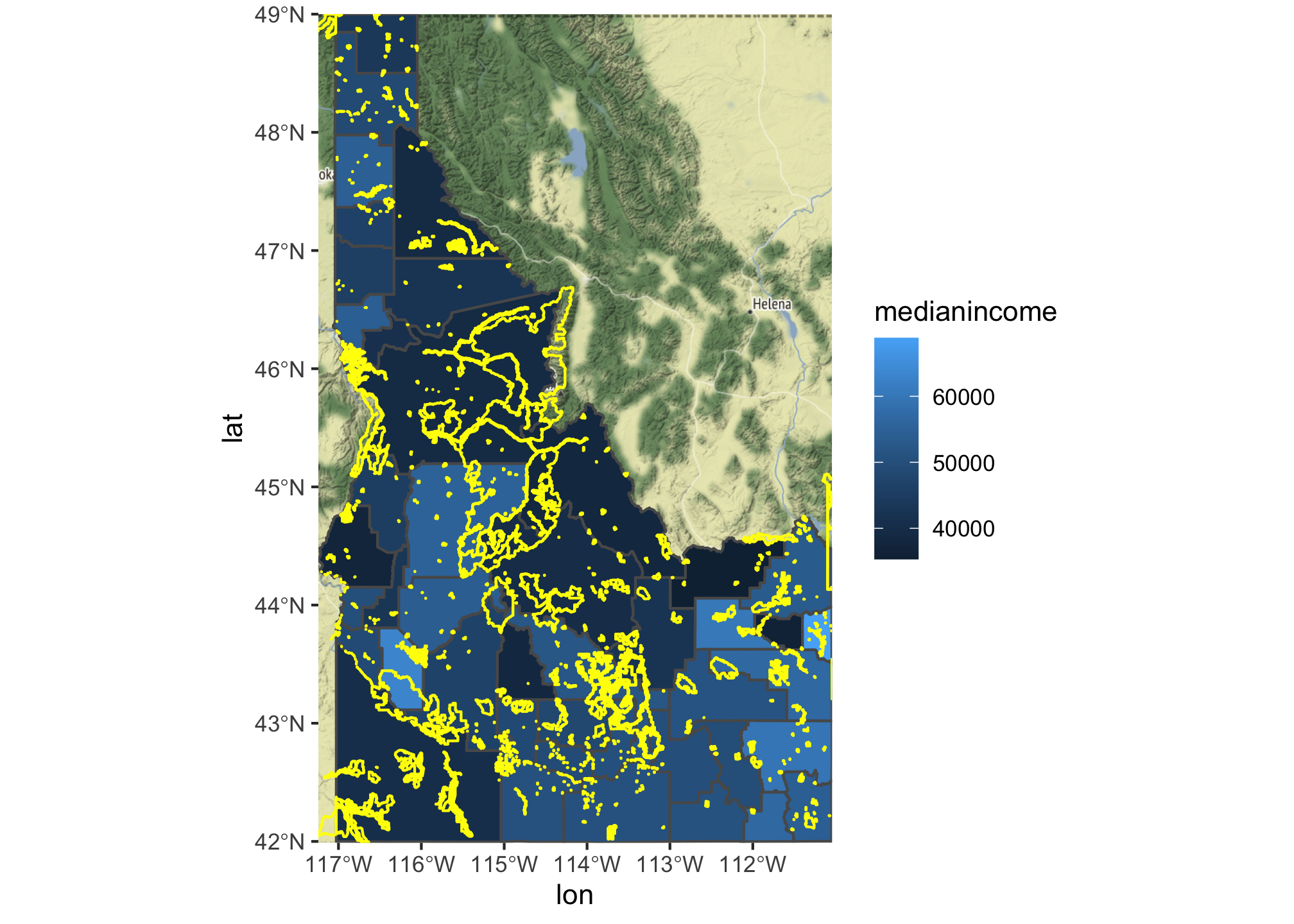
This is… not great. The lines making up the borders of the PAs are too large, the figure is in a strange place, and the background and grid lines are distracting and unnecessary. We can change the ‘weight’ of the border lines for our PAs by adding the size argument to the geom_sf call. Note that we are not doing this inside of the aes argument because we are setting the size to a specific value rather than mapping some of our data to the size aesthetic of the map. We can also make the map a bit more interesting by mapping an additional variable to the aesthetic. Here I’m using the total population of each county to adjust the transparency of the median income colors. I do that by specifying that I want the alpha value to be taken from the log() of the population variable. I also add the scale_alpha(guide = "none") to keep the transparency from being added to the legend. Finally, I move the legend to a new place using the theme() arguments and get rid of some of the extraneous gridlines using theme_bw(). You can check out the ggplot2 package page for a variety of preset themes like theme_bw(). I tend to use theme_bw() a lot or I write my own function with them elements. Note also that you have to modify the theme elements after you set the theme_bw() argument or it will overwrite all of the changes you hope to make.
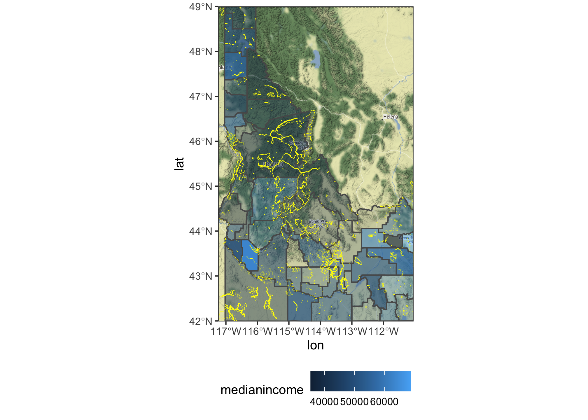
ggmap(bg) +
geom_sf(data = st_transform(id.census, 4326), mapping = aes(fill = medianincome, alpha=log(pop)), inherit.aes = FALSE) +
geom_sf(data=st_transform(idaho.pas, 4326), color="yellow", fill=NA, size = 0.05, inherit.aes = FALSE) +
scale_fill_continuous() +
scale_alpha(guide = "none")+
coord_sf(crs = st_crs(4326)) +
theme_bw() +
theme(legend.direction = "horizontal", legend.position = "bottom", legend.justification = "center")
## Coordinate system already present. Adding new coordinate system, which will replace the existing one.
Creating your own theme for mapping
You can check out the ggplot2 package page for a variety of preset themes like theme_bw(). Alternatively, you can write your own custom function with them elements. I do that in the code chunk below. Note that you can include options for any of the theme elements you like (this is useful for ensuring that your fonts and colors are the same across figures in a mansucript, for example).
theme_map <- function(...) {
theme_minimal() +
theme(
#text = element_text(family = "Ubuntu Regular", color = "#22211d"),
axis.line = element_blank(),
axis.text.x = element_blank(),
axis.text.y = element_blank(),
axis.ticks = element_blank(),
axis.title.x = element_blank(),
axis.title.y = element_blank(),
# panel.grid.minor = element_line(color = "#ebebe5", size = 0.2),
panel.grid.major = element_line(color = "white", size = 0.002),
panel.grid.minor = element_line(color = "white", size = 0.002),
plot.background = element_rect(fill = "white", color = NA),
panel.background = element_rect(fill = "white", color = NA),
legend.background = element_rect(fill = "white", color = NA),
panel.border = element_blank(),
...
)
}
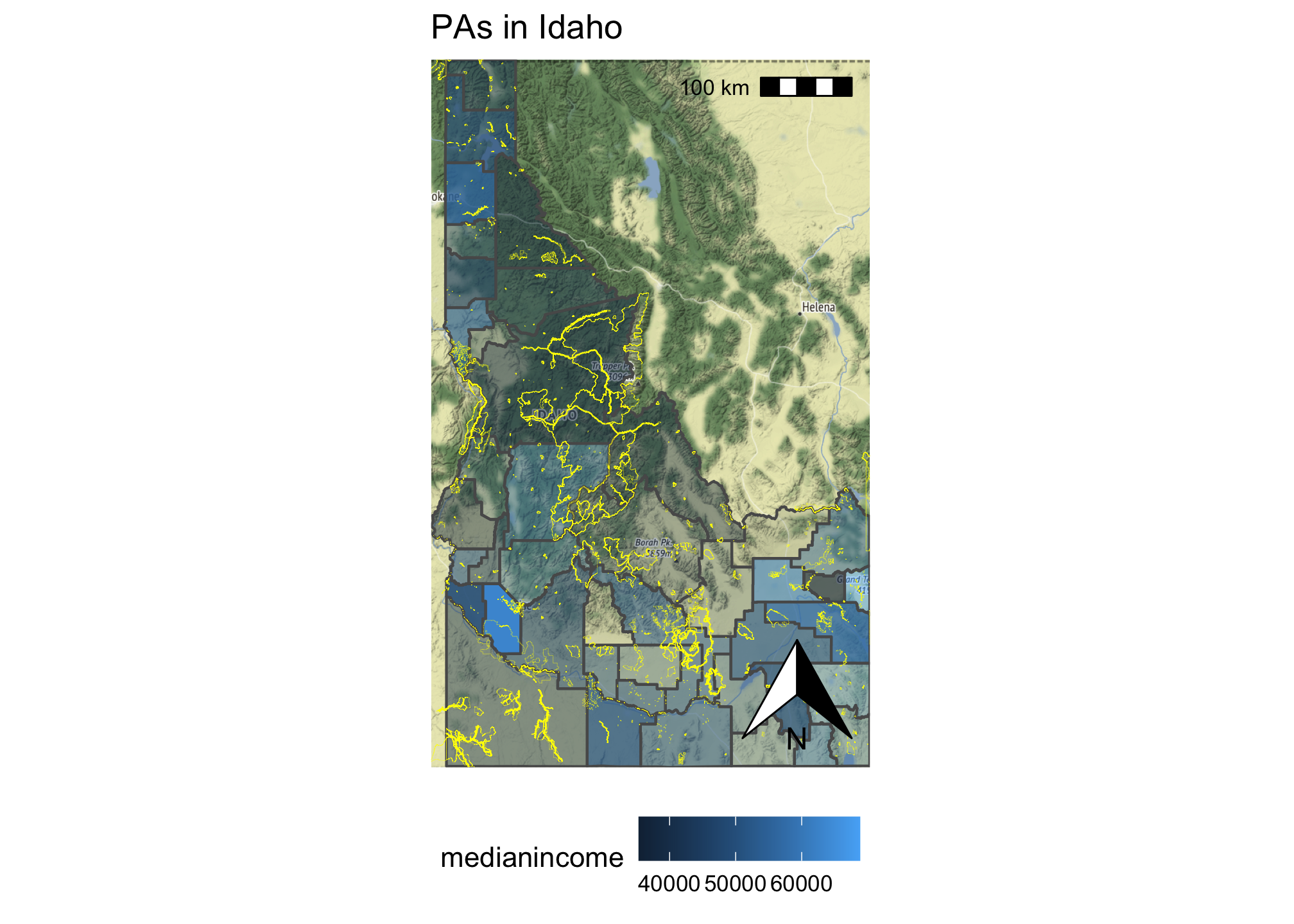
Adding some additional ornamentation
We are getting closer to a map that’s not completely hideous. Let’s add a north arrow and scale bar (thanks to the ggspatial package) and a title for our figure. The annotation_scale() function attempts to guess the scale of the map (which is challenging because of the use of the ggmap basemap).
ggmap(bg) +
geom_sf(data = st_transform(id.census, 4326), mapping = aes(fill = medianincome, alpha=log(pop)), inherit.aes = FALSE) +
geom_sf(data=st_transform(idaho.pas, 4326), color="yellow", fill=NA, size = 0.05, inherit.aes = FALSE) +
scale_fill_continuous() +
scale_alpha(guide = "none")+
coord_sf(crs = st_crs(4326)) +
annotation_scale(location = "tr") +
annotation_north_arrow(location = "br", which_north = "true") +
ggtitle("PAs in Idaho") +
theme_map() +
theme(legend.direction = "horizontal", legend.position = "bottom", legend.justification = "center")
## Coordinate system already present. Adding new coordinate system, which will replace the existing one.
## Scale on map varies by more than 10%, scale bar may be inaccurate
It’s not terrible, so let’s add an inset map and some labels for the county names. We can add labels using the geom_sf_text and control where they are placed using the fun.geometry option. The geom_sf_label provides additional options if you need them. We can add an inset map by creating a second ggplot object, creating a polygon that captures the bounding box (using st_as_sfc and st_bbox) and then adding those to the plot using the patchwork syntax.
main.map <- ggmap(bg) +
geom_sf(data = st_transform(id.census, 4326), mapping = aes(fill = medianincome), inherit.aes = FALSE) +
geom_sf(data=st_transform(idaho.pas, 4326), color="yellow", fill=NA, inherit.aes = FALSE) +
geom_sf_text(data = st_transform(idaho.counties, 4326), aes(label = NAME, geometry = geometry), fun.geometry = st_centroid, inherit.aes=FALSE, color = "white") +
scale_fill_continuous() +
coord_sf(crs = st_crs(4326)) +
annotation_scale(location = "tl") +
annotation_north_arrow(location = "br", which_north = "true") +
ggtitle("PAs in Idaho") +
theme(legend.direction = "horizontal", legend.position = "bottom", legend.justification = "center") +
theme_bw()
## Coordinate system already present. Adding new coordinate system, which will replace the existing one.
not.conus <- c("AK", "HI", "DC", "MP", "GU", "VI", "AS", "PR")
conus <- states() %>%
filter(., !(STUSPS %in% not.conus)) %>%
st_transform(., 4326)
bbox <- st_as_sfc(st_bbox(st_transform(idaho, 4326)))
inset.map <- ggplot(conus)+
geom_sf(fill="lightgray", color="black") +
geom_sf(data = st_as_sfc(st_bbox(st_transform(idaho, 4326))),fill=NA, color = "red") +
theme_void()
complete <- main.map + inset_element(inset.map, left = 0.5, bottom = 0.5, right = 1, top = 1, align_to = "full")
#ggsave("insetmap.png", plot=complete)

Converting a ggplot object to a plotly interactive visualization
We can part of the benefit of buildng these maps in ggplot2 is the ease with which we can convert them into interactive visualziations using plotly. Here is a simple version using the ggplotly function from the plotly package.
p <- ggplot() +
geom_sf(data = st_transform(id.census, 4326), mapping = aes(fill = medianincome), inherit.aes = FALSE) +
geom_sf(data=st_transform(idaho.pas, 4326), color="yellow", fill=NA, inherit.aes = FALSE) +
scale_fill_continuous()
ggplotly(p)