Static maps in R
Loading the data
We are going to use the database that we built last week as the starting place for making some static maps this week. We’ll load that here along with some new (at least for this course) packages. The ggmap package allows easy downloads of basemaps from Google (requires a key) and Stamen for use in mapping (and within ggplot2). The cartogram package facilitates thematic changes of the geometry based on other attributes (e.g., population). The patchwork package allows easy composition of multi-figure plots. I’m not going to be able to demonstrate the full capabilities of these packages in one example, but their webpages have tons of useful information. You should check those out!
library(tidyverse)
## ── Attaching packages ─────────────────────────────────────── tidyverse 1.3.1 ──
## ✓ ggplot2 3.3.5     ✓ purrr   0.3.4
## ✓ tibble  3.1.3     ✓ dplyr   1.0.7
## ✓ tidyr   1.1.3     ✓ stringr 1.4.0
## ✓ readr   2.0.0     ✓ forcats 0.5.1
## ── Conflicts ────────────────────────────────────────── tidyverse_conflicts() ──
## x dplyr::filter() masks stats::filter()
## x dplyr::lag()    masks stats::lag()
library(pander)
library(sf)
## Linking to GEOS 3.8.1, GDAL 3.2.1, PROJ 7.2.1
library(terra)
## terra version 1.3.22
##
## Attaching package: 'terra'
## The following object is masked from 'package:pander':
##
##     wrap
## The following object is masked from 'package:dplyr':
##
##     src
library(units)
## udunits database from /Library/Frameworks/R.framework/Versions/4.1/Resources/library/units/share/udunits/udunits2.xml
library(ggmap)
## Google's Terms of Service: https://cloud.google.com/maps-platform/terms/.
## Please cite ggmap if you use it! See citation("ggmap") for details.
##
## Attaching package: 'ggmap'
## The following object is masked from 'package:terra':
##
##     inset
library(cartogram)
##
## Attaching package: 'cartogram'
## The following object is masked from 'package:terra':
##
##     cartogram
library(patchwork)
##
## Attaching package: 'patchwork'
## The following object is masked from 'package:terra':
##
##     area
library(tmap)
library(viridis)
## Loading required package: viridisLite
landval <- terra::rast('/Users/matthewwilliamson/Downloads/session04/idval.tif')
#landval <- rast('/Users/mattwilliamson/Google Drive/My Drive/TEACHING/Intro_Spatial_Data_R/Data/session16/Regval.tif')
#mammal.rich <- rast('/Users/mattwilliamson/Google Drive/My Drive/TEACHING/Intro_Spatial_Data_R/Data/session16/Mammals_total_richness.tif')
mammal.rich <- rast('/Users/matthewwilliamson/Downloads/session16/Mammals_total_richness.tif')
mammal.rich <- catalyze(mammal.rich) #rmemeber we had to get the layer we wanted from the richness data
mammal.rich <- mammal.rich[[2]]

#pas.desig <- st_read('/Users/mattwilliamson/Google Drive/My Drive/TEACHING/Intro_Spatial_Data_R/Data/session04/regionalPAs1.shp')
pas.desig <- st_read('/Users/matthewwilliamson/Downloads/session04/regionalPAs1.shp')
## Reading layer `regionalPAs1' from data source
##   `/Users/matthewwilliamson/Downloads/session04/regionalPAs1.shp'
##   using driver `ESRI Shapefile'
## Simple feature collection with 224 features and 7 fields
## Geometry type: MULTIPOLYGON
## Dimension:     XY
## Bounding box:  xmin: -1714157 ymin: 1029431 xmax: -621234.8 ymax: 3043412
## Projected CRS: USA_Contiguous_Albers_Equal_Area_Conic_USGS_version
pas.proc <- st_read('/Users/matthewwilliamson/Downloads/session16/reg_pas.shp')
## Reading layer `reg_pas' from data source
##   `/Users/matthewwilliamson/Downloads/session16/reg_pas.shp'
##   using driver `ESRI Shapefile'
## Simple feature collection with 544 features and 32 fields
## Geometry type: MULTIPOLYGON
## Dimension:     XY
## Bounding box:  xmin: -2034299 ymin: 1004785 xmax: -530474 ymax: 3059862
## Projected CRS: USA_Contiguous_Albers_Equal_Area_Conic_USGS_version
#pas.proc <- st_read('/Users/mattwilliamson/Google Drive/My Drive/TEACHING/Intro_Spatial_Data_R/Data/session16/reg_pas.shp')
#combine the pas into 1, but the columns don't all match, thanks PADUS

colnames(pas.proc)[c(1, 6, 8, 10, 12, 22, 25)] <- colnames(pas.desig) #find the columnames in the proc dataset and replace them with the almost matching names from the des.
## Warning in colnames(pas.proc)[c(1, 6, 8, 10, 12, 22, 25)] <-
## colnames(pas.desig): number of items to replace is not a multiple of replacement
## length
gap.sts <- c("1", "2", "3")
pas <- pas.proc %>%
  select(., colnames(pas.desig)) %>%
  bind_rows(pas.desig, pas.proc) %>%  #select the columns that match and then combine
  filter(., State_Nm == "ID" & GAP_Sts %in% gap.sts ) %>% st_make_valid() %>% st_buffer(., 10000)
#Buffering here to deal with some of the linear features along rivers
Making a map of Idaho
We’re going to focus on Idaho in the example (you’ll focus on the West for your homework) so we’ll need a shapefile to make sure we’ve got coverage across the state.
id <- tigris::states(cb=TRUE) %>%
  filter(STUSPS == "ID")
Let’s get everything into the same projection to save some hassle down the road. Because the mammal richness data is the largest, we’ll project everything to that and then crop.
st_crs(mammal.rich)$proj4string
## [1] "+proj=aea +lat_0=37.5 +lon_0=-96 +lat_1=29.5 +lat_2=45.5 +x_0=0 +y_0=0 +datum=NAD83 +units=m +no_defs"
st_crs(landval)$proj4string
## [1] "+proj=aea +lat_0=23 +lon_0=-96 +lat_1=29.5 +lat_2=45.5 +x_0=0 +y_0=0 +datum=NAD83 +units=m +no_defs"
st_crs(pas)$proj4string
## [1] "+proj=aea +lat_0=23 +lon_0=-96 +lat_1=29.5 +lat_2=45.5 +x_0=0 +y_0=0 +datum=NAD83 +units=m +no_defs"
pa.vect <- as(pas, "SpatVector")
id.vect <- as(id, "SpatVector")

pa.vect <- project(pa.vect, mammal.rich)
id.vect <- project(id.vect, mammal.rich)

land.val.proj <- project(landval, mammal.rich)

mam.rich.crop <- crop(mammal.rich, id.vect)
id.val.crop <- crop(land.val.proj, id.vect)
We’ll also add population to our census data by making a change to our tidycensus call (remember that you’ll need your Census API key to use tidycensus (details here). Notice that we also use spread here to move the data into wide format. Let’s do that:
id.census <- tidycensus:: get_acs(geography = "county",
              variables = c(medianincome = "B19013_001",
                            pop = "B01003_001"),
              state = c("ID", "MT"),
              year = 2018,
              key = key,
              geometry = TRUE) %>%
                st_transform(., crs(pa.vect)) %>%
  select(-moe) %>%
  spread(variable, estimate)
Now we’ll do the necessary extractions and join everything together into a single dataframe that we can use for plotting.
pa.summary <- st_join(st_as_sf(pa.vect), id.census, join = st_overlaps)

pa.summary <- pa.summary %>%
  group_by(Unit_Nm) %>%
  summarize(., meaninc = mean(medianincome, na.rm=TRUE),
            meanpop = mean(pop, na.rm=TRUE))
#double check to see that I got the right number of rows
nrow(pa.summary) ==length(unique(pas$Unit_Nm))
## [1] TRUE
pa.zones <- terra::rasterize(pa.vect, mam.rich.crop, field = "Unit_Nm")
mammal.zones <- terra::zonal(mam.rich.crop, pa.zones, fun = "mean", na.rm=TRUE)
landval.zones <- terra::zonal(id.val.crop, pa.zones, fun = "mean", na.rm=TRUE)
#Note that there is one few zone than we have in our PA dataset. This is because we have an overlapping jurisdicition; we'll ingnore that now but it's a common problement with using the PADUS

summary.df <- pa.summary %>%
  left_join(., mammal.zones) %>%
  left_join(., landval.zones)
## Joining, by = "Unit_Nm"
## Joining, by = "Unit_Nm"
#You will have some NAs here owing to the strange nature of the PADUS
Building a quick map
Up until now, we’ve been using the base::plot function to generate rapid visualizations of our data. That’s fine, but it takes a fair amount of work to get those graphics into something resembling a publication-quality map. The tmap package is a versatile package designed specifically for making thematic maps. It generally builds on the grammar of graphics logic and follows most of the ggplot2 conventions. It’s not quite as flexible as ggplot2 and doesn’t allow easy integration for different types of non-spatial figures (but see patchwork for ways to address this); however, it has a lot of functionality for both static and interactive mapping and deals with raster datasets in a way that is more intuitive than ggplot2. I’ll introduce a few of the features here, but I would encourage you to take a look at Manuel Gimond’s set of notes and the tmap intro pages to get broader exposure to the capabilities of tmap. We’ll revisit some of these next week, but let’s get started with some simple examples.
A simple example
tm_shape(summary.df) + tm_polygons(col = "meanpop",  border.col = "white") +
  tm_legend(outside = TRUE)
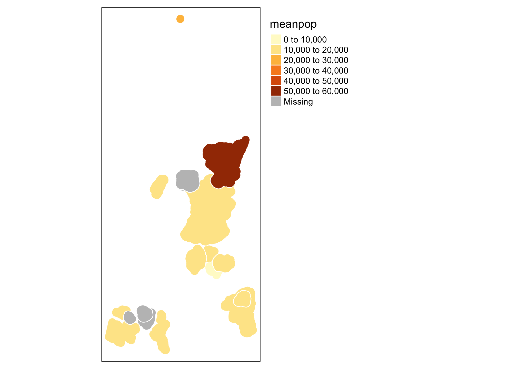
This isn’t particularly pretty or (even useful), but let’s take a look at a few things. The tm_shape specifies which dataset we are talking about (the data component of the grammar of graphics[gg]). The tm_polygons call allows you to specify a number of additional gg elements including the aesthetics (here we are telling R that colors should be assigned based on the meanpop variable, but that border colors are a fixed value), the geometric object to be used (polygons - specified by tm_polygons, but there are a variety of tm_* functions that can be used). You can also specify a number of additional map elements within the tm_shape function call or use things like tm_legend to exert more control. See ?tm_shape for a full description. Let’s add a state boundary and a raster before moving on.
tm_shape(mam.rich.crop) +
  tm_raster("Value", palette = viridis(n=50), n=50, legend.show=FALSE, legend.hist = TRUE, legend.hist.title = "Species Richness") +
tm_shape(id) +
  tm_borders("white", lwd = .75) +
tm_shape(summary.df) +
  tm_polygons(col = "meanpop",  border.col = "white", title="Mean Population") +
  tm_legend(outside = TRUE)
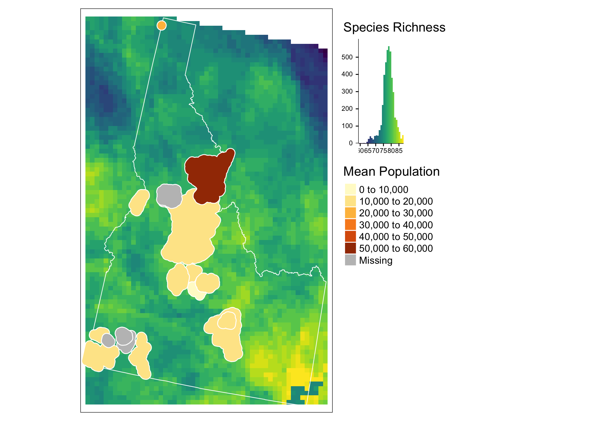
Here again we are using the tm_shape call to specify which data we are talking about, then assigning aesthetics for that data based on tm_raster and tm_shape. Notice that you can control whether a particular item appears in the legend with the legend.show option and that you can change palettes (here using viridis) to link data values to color values. Notice the use of + as a way of adding layers and aesthetics.This is also how ggplot2 works. We’ll return to that in a moment.
Building a choropleth map with the grammar of graphics
The tmap approach is relatively straigtforward and may achieve all you ever hope for in map production. That said, ggplot2 is generally the “industry standard” for plotting in R. That doesn’t mean it’s the best, or the easiest; but it is under constant development to accomodate more and more different kinds of data. Let’s start with a simple example:
ggplot(summary.df) +
  geom_sf(mapping = aes(fill = meaninc))
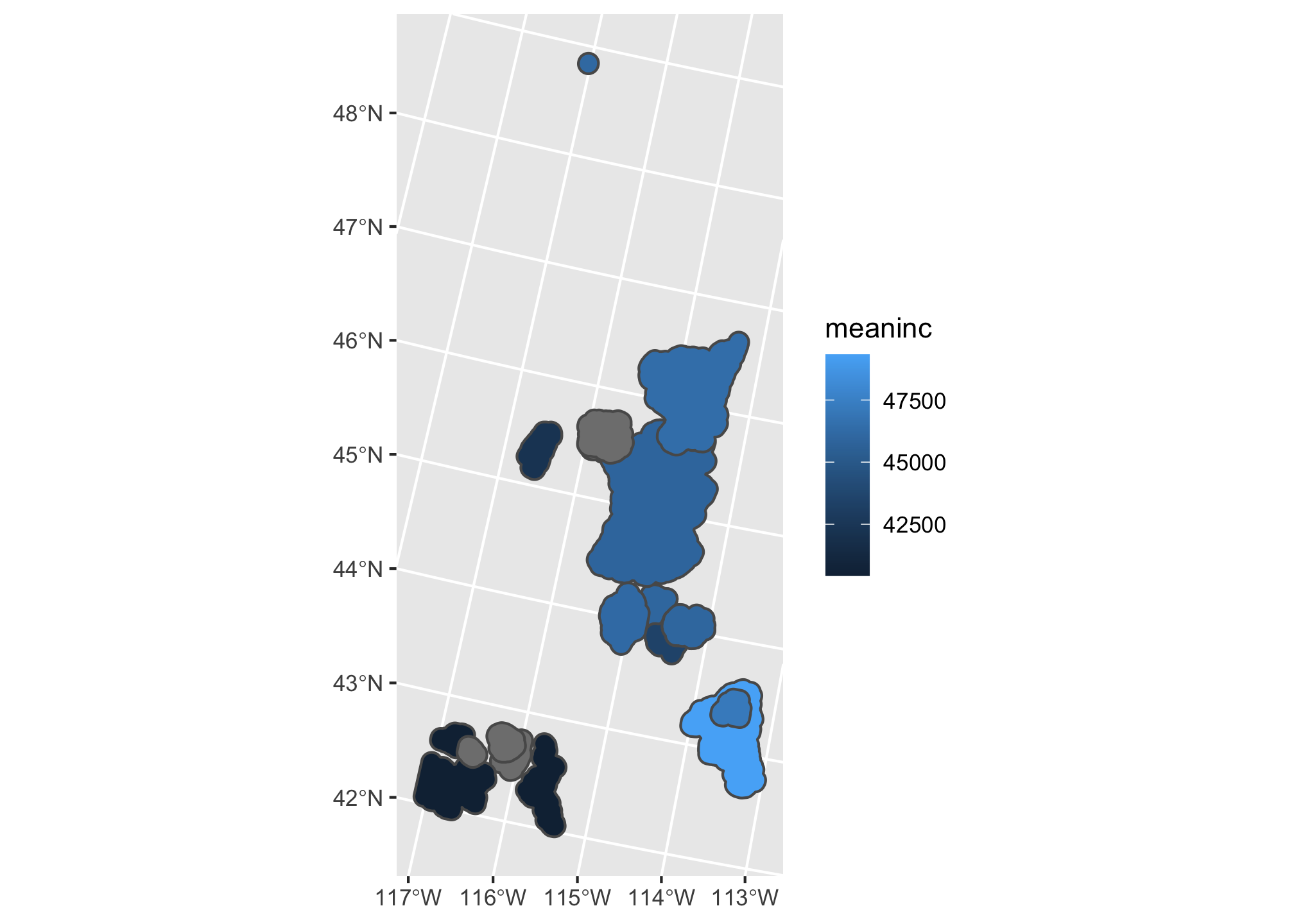
Just like the tmap, but with some different defaults! Note here that mapping = aes() is the call that specifies the mapping between the data and the aesthetics (In this case, we want the fill of the polygons to be based on the mean income). The geom_ call specifies the geometric element. In this case, geom_sf() lets ggplot2 know that mapping=aes(x= longitude, y=lattitude). We can add another layer similar to how we did with tmap:
ggplot(summary.df) +
  geom_sf(mapping = aes(fill = meaninc)) +
  geom_sf(data=id, fill=NA,color="black")
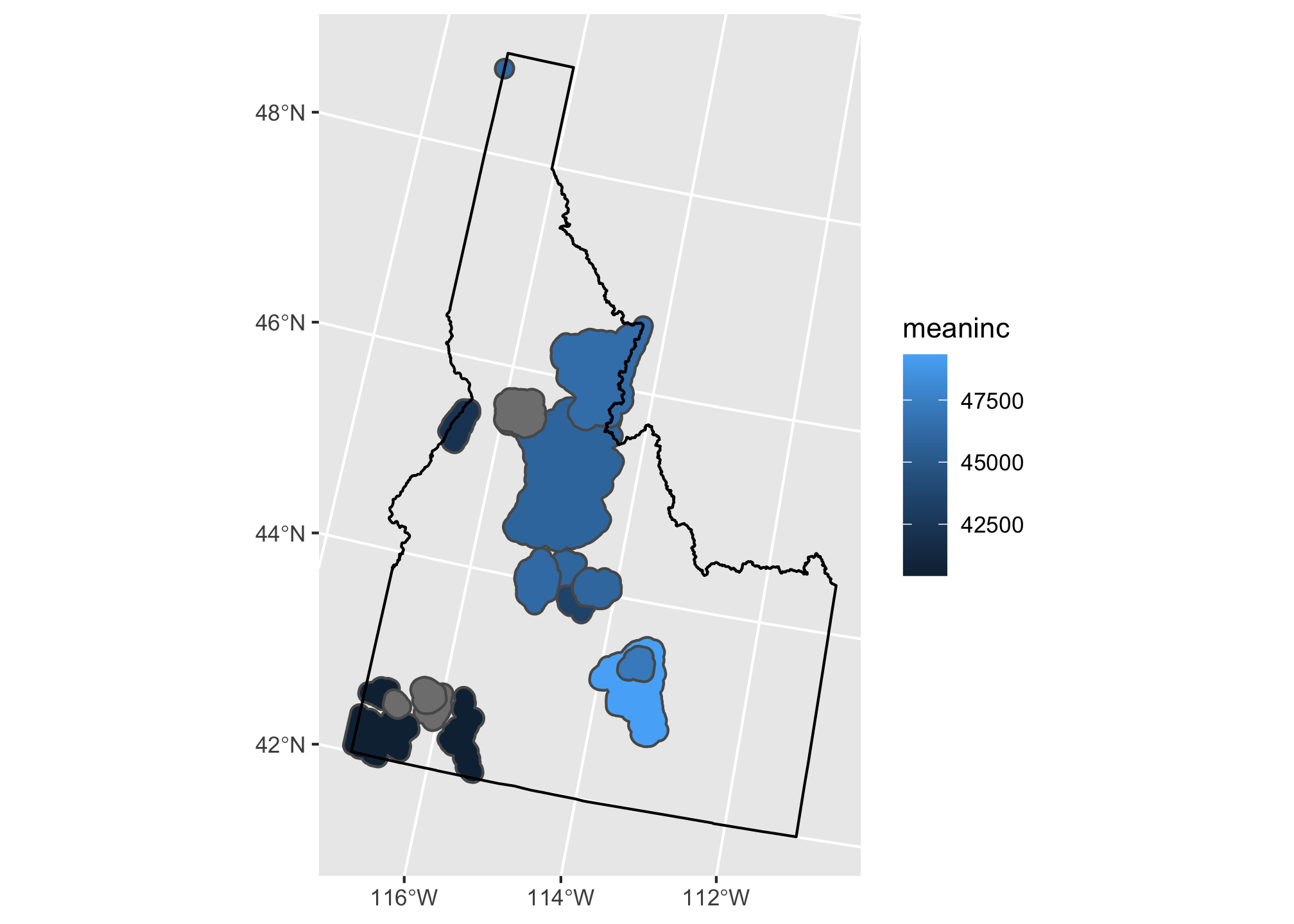
Here we’ve added a second call to geom_sf and added our Idaho shapefile. This time we don’t want to map any of the data beyond the geometry to an aesthetic so we leave out the mapping argument and set the fill and color to single values. Now let’s add a little fanciness by adding a basemap from ggmap (check out the ?ggmap and ?get_map for details):
Adding a basemap
bg <- ggmap::get_map(as.vector(st_bbox(id)))
## Source : http://tile.stamen.com/terrain/7/22/43.png
## Source : http://tile.stamen.com/terrain/7/23/43.png
## Source : http://tile.stamen.com/terrain/7/24/43.png
## Source : http://tile.stamen.com/terrain/7/22/44.png
## Source : http://tile.stamen.com/terrain/7/23/44.png
## Source : http://tile.stamen.com/terrain/7/24/44.png
## Source : http://tile.stamen.com/terrain/7/22/45.png
## Source : http://tile.stamen.com/terrain/7/23/45.png
## Source : http://tile.stamen.com/terrain/7/24/45.png
## Source : http://tile.stamen.com/terrain/7/22/46.png
## Source : http://tile.stamen.com/terrain/7/23/46.png
## Source : http://tile.stamen.com/terrain/7/24/46.png
## Source : http://tile.stamen.com/terrain/7/22/47.png
## Source : http://tile.stamen.com/terrain/7/23/47.png
## Source : http://tile.stamen.com/terrain/7/24/47.png
ggmap(bg) +
   geom_sf(data = summary.df, mapping = aes(fill = meaninc), inherit.aes = FALSE) +
  geom_sf(data=id, fill=NA,color="black", inherit.aes = FALSE) +
  coord_sf(crs = st_crs(4326))
## Coordinate system already present. Adding new coordinate system, which will replace the existing one.
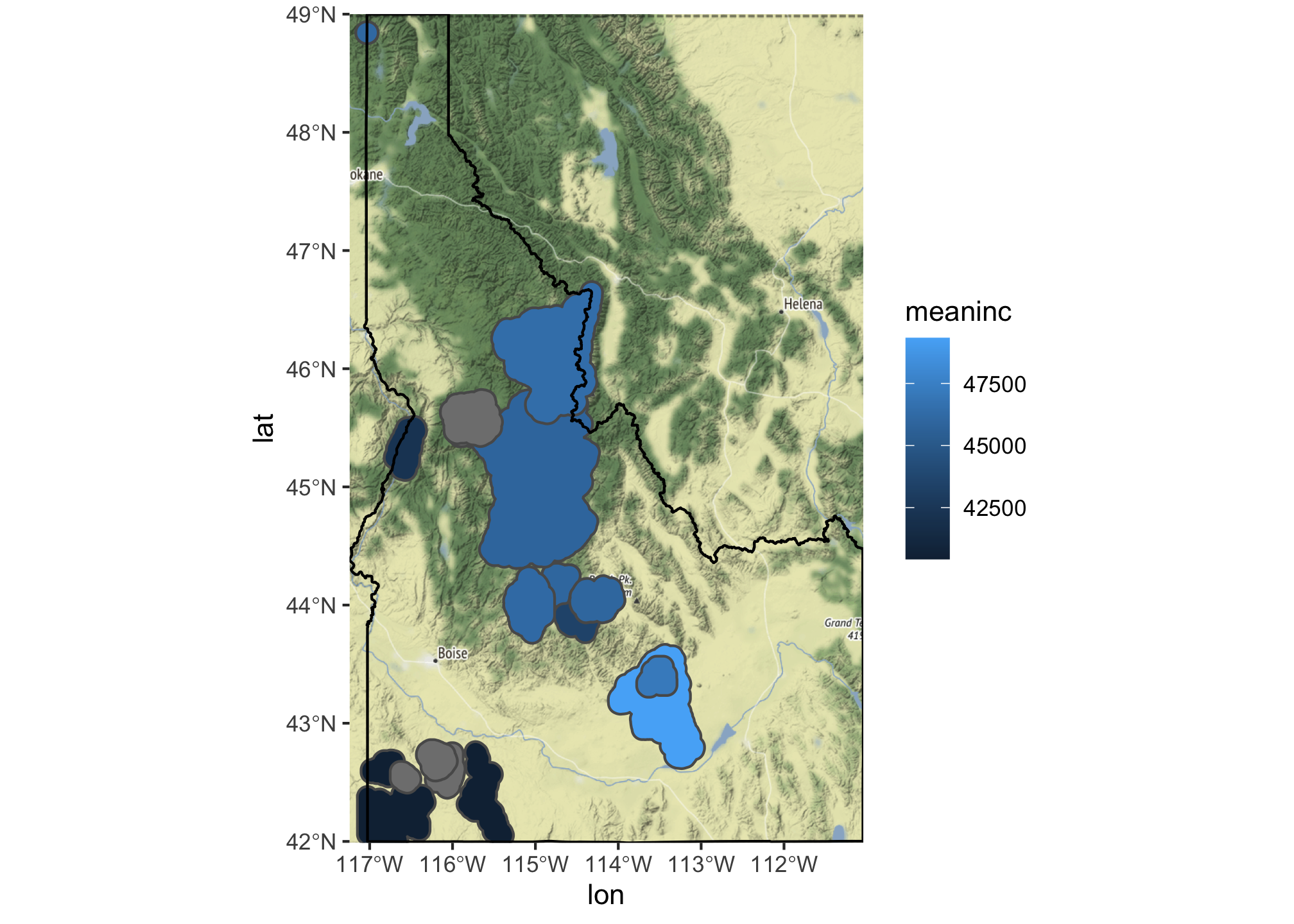
We are still building the map layer-by-layer, but in this case had to use ggmap to get R to recognize that we wanted to use the downloaded file as the base for the plot. We also have to use inherit.aes=FALSE to allow each additional geom to have it’s own set of aesthetics. Finally, we use coord_sf() to add a new coordinate system to the map because ggmap downloads everything in WGS84.
Changing Scales
Now that we have things starting to look nice, let’s see if we can add a few more aesthetics and introduce a scale
ggmap(bg) +
  geom_sf(data = summary.df, mapping = aes(fill = Value,
                                           alpha = (idval - max(idval, na.rm=TRUE))/(max(idval, na.rm=TRUE)-min(idval, na.rm = TRUE))), inherit.aes = FALSE) +
  geom_sf(data=id, fill=NA,color="black", inherit.aes = FALSE) +
  scale_fill_viridis(option="magma")+
  coord_sf(crs = st_crs(4326))
## Coordinate system already present. Adding new coordinate system, which will replace the existing one.
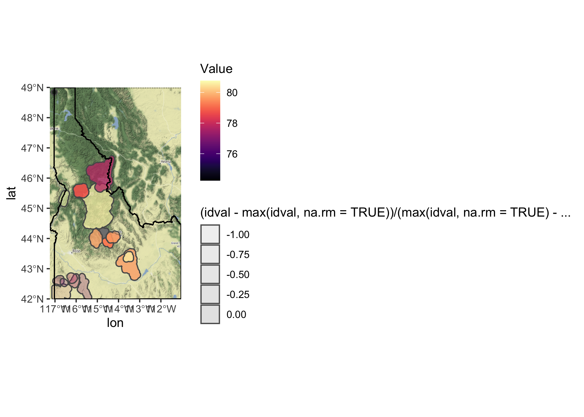
Here we’ve added an additional aesthetic mapping for alpha which sets the transparency and then used scale_fill_viridis_ to map the species richness value to the viridis color palette. We’ve then ‘softened’ that color based on the cost of land in that area. You can find additional palettes and options using the ?scale_fill_ helpfiles.
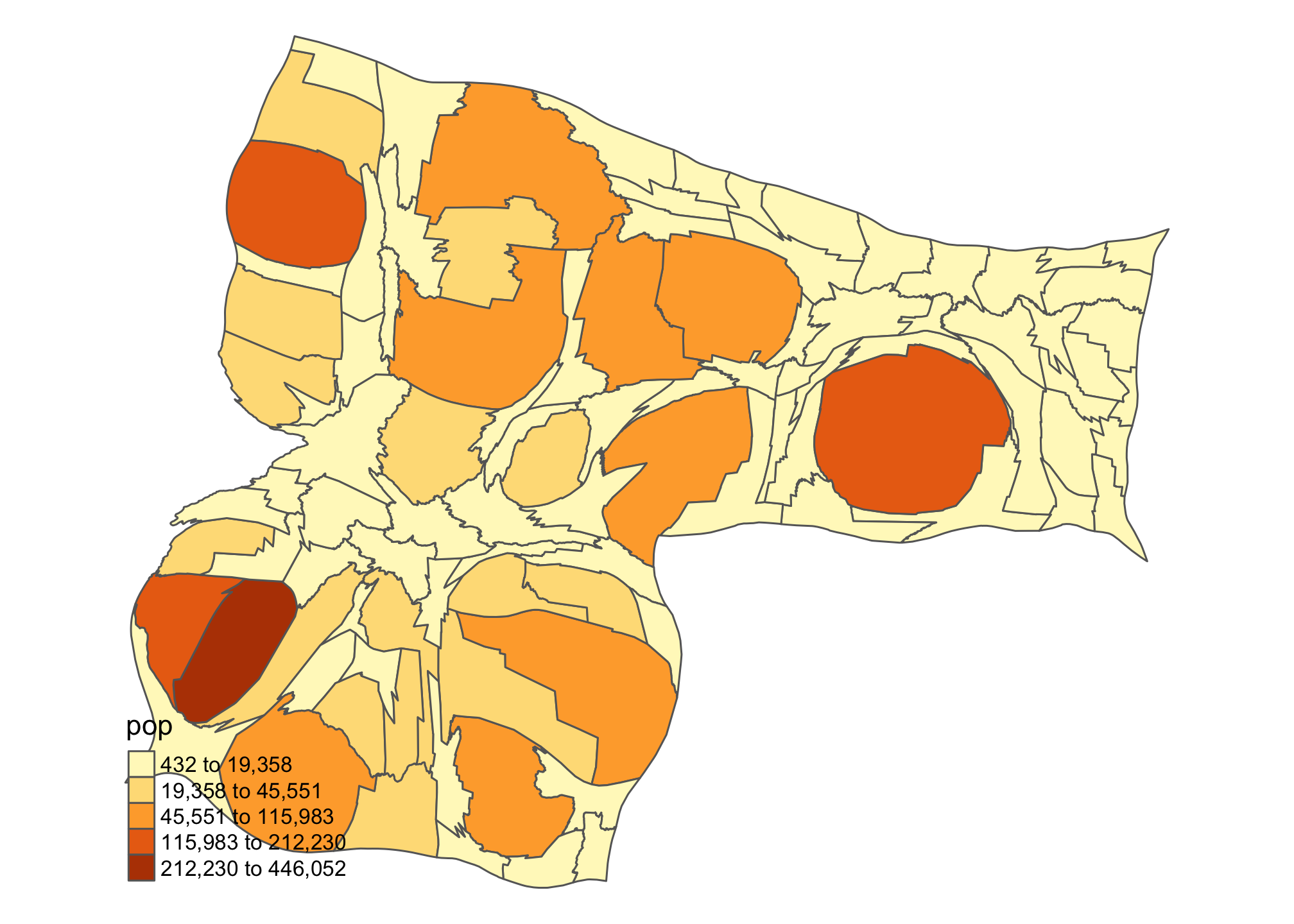
Building a cartogram
One of the beauties of teaching a class like this is it gives me the chance to do something I don’t usually get to do. In this case, that thing is drawing cartograms. Let’s look at two versions of Idaho using the cartogram package: population vs. income.
id_pop <- cartogram_cont(id.census, "pop", itermax = 5)
## Mean size error for iteration 1: 4.81793622368303
## Mean size error for iteration 2: 4.00848667518635
## Mean size error for iteration 3: 3.34903616842005
## Mean size error for iteration 4: 2.79937191745082
## Mean size error for iteration 5: 2.34932232913512
id_inc <- cartogram_cont(id.census, "medianincome", itermax = 5)
## Mean size error for iteration 1: 1.86126345506573
## Mean size error for iteration 2: 1.46673557062935
## Mean size error for iteration 3: 1.26459996079085
## Mean size error for iteration 4: 1.15581249947152
## Mean size error for iteration 5: 1.09513236018306
tm_shape(id_pop) + tm_polygons("pop", style = "jenks") +
  tm_layout(frame = FALSE, legend.position = c("left", "bottom"))
tm_shape(id_inc) + tm_polygons("medianincome", style = "jenks") +
  tm_layout(frame = FALSE, legend.position = c("left", "bottom"))
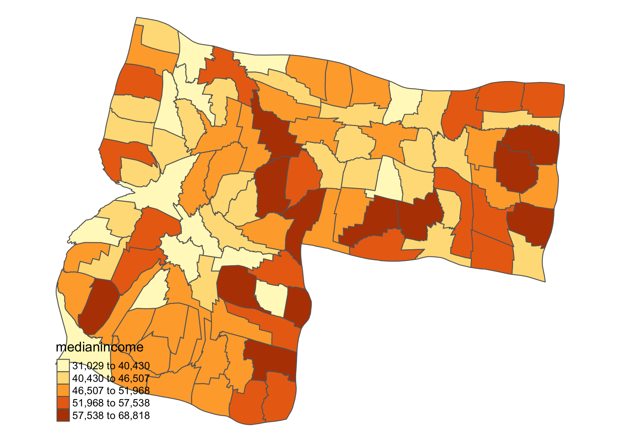
Kind of interesting to see how the ‘center of gravity’ in Idaho shifts when we think about population and income. There’s lots of additional cartogram options that you can explore. Check out the package page.